|
|
Post by ian on Sept 14, 2010 7:27:48 GMT
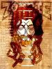
At the recent GNS convention we got to see the original proof cover for Fiend. Now to be honest, I liked the chosen cover but opinions at the convention appeared to slide towards the proof cover. Which do you prefer? 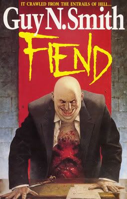 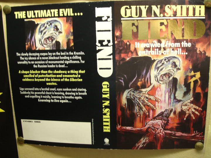 Proof cover picture taken by Steppendonwolf. (Stolen off his facebook page when he wasn't looking) |
|
|
|
Post by Dreadlocksmile on Sept 14, 2010 10:50:00 GMT
Both pieces of artwork have their merits in my opinion. The first submission looks very 'pulpy', with its instant attention grabbing manner. It's gory and grotesque. I like it. However, the second submission (the one Smith went for) is a classic piece of artwork with a hefty tonne of menace in it. When I asked Guy about the first one, he said that the publishers brought it to him for approval and he said "it looks like a Daily Mail cartoon", at which point Sphere agreed and commissioned artist Les Edwards to do the artwork. Linkage for your pleasure... www.lesedwards.com/showpic.php?id=4&pid=446 |
|
|
|
Post by steppedonwolf on Sept 14, 2010 17:27:25 GMT
I have fond memories of the Les Edwards cover. I saw it in a bookshop on the Isle of Wight in 1988, and it freaked me out so much I couldn't bring myself to buy the book - honest!
I've learned to love it now, and was overjoyed to see the full print at WHC Brighton. However, now everyone says Keschev looks like Fred Elliot, so it's spoiled it a bit for me...
The Humphries cover isn't bad at all - the ony thing that spoils it for me is the choice of font for the title. What Sphere used for the Les Edwards cover (and all subsequent GNS releases) is much better, very classy.
|
|
|
|
Post by funkdooby on Sept 20, 2010 6:50:37 GMT
It's the first time I've seen the Graham Humphreys cover in colour and I have to say it looks fine to me. I certainly don't think the lead title launch of Fiend should have been delayed to change it. The drool is a bit OTT but I doubt very much anyone would have been put off buying the book because of the cover illustration.
|
|